Does Your Logo Need a Glow‑Up? 5 Signs It’s Time to Redesign
Your logo shouldn’t live in 2013 while your business is in 2025. Here are five quick signs it’s time to update your logo—and what a modern, strategic redesign can do for your brand.
Is your logo secretly holding your brand back?
Be honest: when you look at your logo, do you feel proud… or slightly embarrassed?
Many founders outgrow their first logo. It was made in Canva at 2 am, by a “friend who’s good at Photoshop”, or by a random online generator. It did the job for a while, but now:
• You’ve raised your prices
• Your services leveled up
• Your logo is still wearing sweatpants
Let’s fix that.
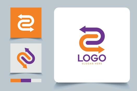
1. Your logo looks different everywhere
If your logo has 6 versions floating around—different fonts, colors, and sizes—your brand feels messy, even if your work is great.
A modern logo system gives you:
• A main logo
• A compact icon (for social, app, favicon)
• Simple rules for spacing and colors
If your audience can’t tell whether two profiles belong to the same brand, you’re leaving trust (and money) on the table.
2. It doesn’t work at small sizes
Great logos survive being shrunk to 32 pixels.
If your logo:
• Disappears in your Instagram profile photo
• Looks fuzzy in the browser tab
• Turns into an abstract blob on mobile
It’s not the algorithm’s fault. It’s the file.
3. It screams “old internet”
Trends change. If your logo is full of:
• Over‑detailed gradients
• Random swooshes from 2010
• Three different fonts fighting for attention
It’ll make your brand feel outdated, even if everything else is modern.
A good redesign doesn’t mean “be boring”. It means:
• Cleaner shapes
• Clear hierarchy
• A color palette that works on web, print, and dark mode
4. It doesn’t match who you are now
Maybe you started as a one‑person freelancer and now you’re a full studio or agency. Or you shifted from “I do everything” to “We specialise in X”.
Your logo should match your positioning today, not who you were five years ago.
When we design logos at Ubunzi Studio, we always ask:
• Who do you want to attract now?
• What should people feel in the first 5 seconds?
• Where will your logo actually live: LinkedIn, SaaS dashboard, packaging, slide decks?
A logo that fits your current goals will automatically feel more “you”.
5. It doesn’t connect with the rest of your brand
If your logo is playful but your website is super serious (or the other way around), something’s off.
Your logo should plug into a bigger brand identity:
• Colors used on your website buttons and headings
• Typography that appears in your decks and landing pages
• Layout rules that make everything feel intentional
That’s when people start recognising you without even seeing your name.
When should you definitely redesign?
Here are three quick “yes, do it” situations:
1. You’ve changed your niche or target audience
2. You’re embarrassed to put your logo on a proposal or app
3. You’re about to invest in a new website or product launch anyway
A thoughtful logo redesign at this moment multiplies everything else you’re doing—ads, content, sales calls, even your pricing.
If you want help, Ubunzi Studio specialises in Logo & Brand Identity that already play nicely with your website, AI product, and apps—so you don’t have to redesign everything twice.